Empowering ecommerce through refunds @ Roqqett
Web App
Role | Design lead, working alongside my product manager and development agency
Skills
Tools:
Figma
Wireframing
Prototyping
The previous, rushed solution resulted in slowing down business workflows.
The old portal was built and designed by the development agency under time constraints. Whilst it worked as an MVP, this showed cracks very quickly.
The 2 main problems were poor scannability and scalability
It was hard for business owners to skim and find relevant information quickly as there was too much information in the merchant portal, it
Since the previous layout didn't allow for scaling the platform, essential features for ecommerce like refunds could not be added easily.The

The old platform
Therefore, I designed to optimise for scannability + scalability for refunds
The solution to this was
Redesign the payments page to present the information clearly
Add refund and reconciliation capabilities and future features in mind
Set precedence for the new UI style of the portal
User flow mapping to understand the hierarchy of information + technical architecture
The merchant portal is the backend of merchants using Roqqett, housing many key capabilities such as refunds.
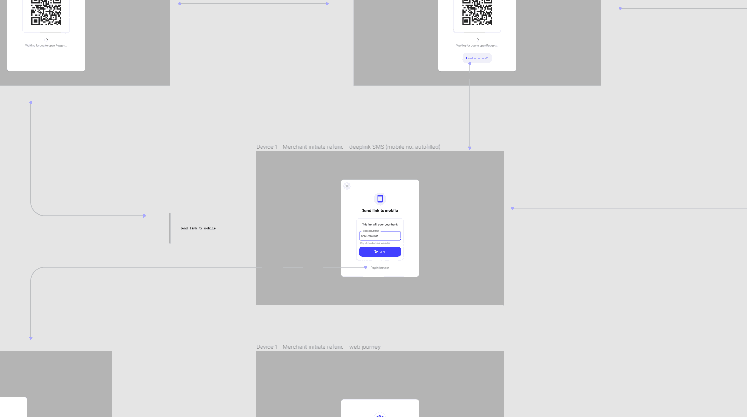
I mapped out the key moments in the user flow to create an intuitive experience whilst streamlining the information on the original portal to create hierarchy.

Creating complex user flows involving multiple devices
The redesigned merchant portal reduced overwhelm whilst allowing for crucial actions
Allowing for multiple statuses and other features as the product scales, whilst keeping only the crucial information on this page.

Key learnings earnings
Not every piece of information is important, prioritise the most crucial to reduce overwhelm and increase the value of your product.
Building an MVP requires a fine balance between optimising for time to value, whilst not sabotaging your future self with re-designs / re-architectures because the MVP was so rudimentary.
